Turner 2012
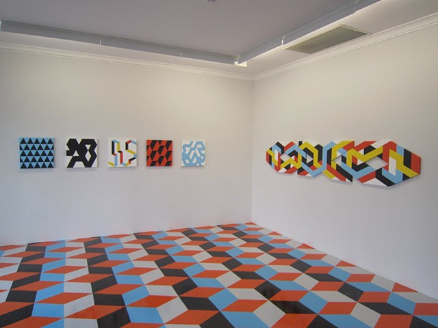
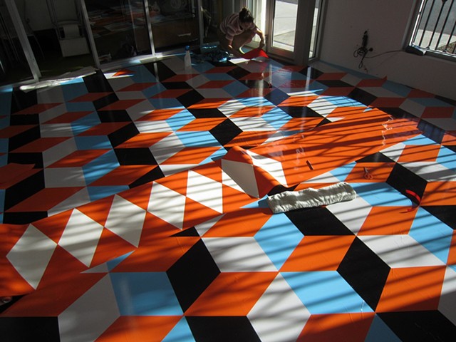
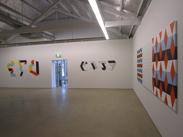
Trevor Richards' recent exhibition radiated colour in the otherwise wintry streetscape. An eye-popping pattern of coloured vinyl had been stuck to the floor of the front room. Alternating stripes of light grey, light blue and a blue that is almost black were overlaid with a repeating pattern of orange diamond shapes so that the overall appearance mimicked a tessellated tiled floor. However, each piece of vinyl had been cut and laid by hand and the resultant creases and misalignments refused to let the mimicry be sustained. Instead, the DIY nature of these faux-tiles was cheerfully asserted. Nonetheless, like its antecedents in medieval European and Islamic architecture, the resultant pattern created illusions of three dimensionality. In this case, illusory boxes appeared to pile up towards the far corner of the room. However, on second glance, the illusion appeared inverted and it is this "multi-stable" perceptual effect that is the subject of Richards’ recent works.
Richards is a founding member of AC4CA, a group of Western Australian artists who work within the traditions of Concrete Art and have strong connections with other non-objective artists in Australia, such as Andrew Leslie and John Nixon, and in Europe. Indeed, Swiss artist Daniel Gottin is a current member of the group. Whilst many AC4CA members exhibit regularly in Perth, their endeavours are frequently presented elsewhere. Richards was included in a 2008 German exhibition called Contemporary Australian Non-Objective Art, showed solo in 2011 at ParisCONCRET, a Parisian venue dedicated to contemporary non-objective practice, and at Peloton in Sydney in 2011 as well as at Everything Nothing Projects in Canberra in 2012.
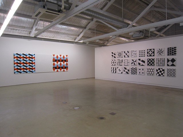
At Turner Galleries, six paintings of geometric patterns, produced in combinations of two or more of the same colours as in the vinyl floor work (with the addition of yellow), were installed in the front room. Richards has used a restricted palette of five pre-mixed industrial paints for some time as it enables him to focus on the orchestration of colour through its proportionate use and relative positioning. His recent use of greyscale versions of those five colours permits the structure of the pattern to become the central concern.
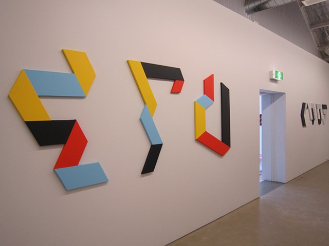
The patterns seemed determined by a private logic. Richards had selected areas of an underlying grid onto which he applied flat colour and left the remaining areas as ground. A close examination of Blue Crossing (2010) revealed the pencilled grid but the rationale for selection and colouration remained elusive. OXO DNA (2009), was composed of two hexagonally shaped canvases and one that was x- shaped. These fitted snugly together enabling the dazzlingly complex pattern to wind uninterrupted across all three supports.
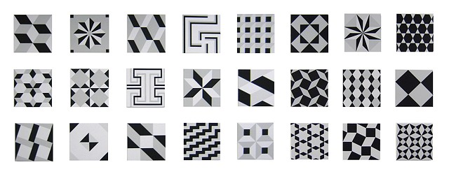
An entire wall of the main gallery space was devoted to three rows of eight small, square canvases, collectively titled Sampler 1 - 24 (2011-2012). A grey scale pattern was painted on each but viewed together, the works became an arresting arrangement of illusory stars, matchboxes, paper chains and Ikea shelves. Richards wouldn’t mind anyone making such associations. In fact, whilst his work can be understood as non-objective, the titles of his works often hint at playful, domestic meanings. I suspect OXO DNA, (2009) is named after not only the twisting linear painted pattern but also after the “O”, “X” and “O” shaped canvases themselves.
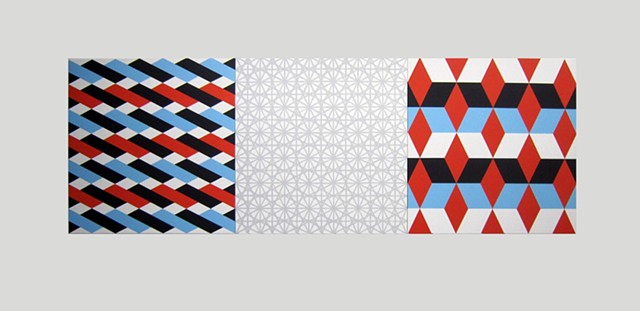
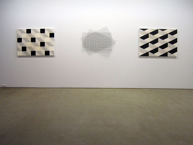
Siena (2011), San Giorgio Maggiore (2011) and Correr (2011) are named after the Italian cathedrals and palace in which Richards found the designs that underpin these paintings. Siena (2011) is a magnificent triptych. On its central panel, Richards painted what he called the 'mother grid’ from which the patterns on the outer panels are derived. The outer panels, like all the painted works described to date, were produced using rollers and masking tape. However, the light grey, dense network of lines on the centre panel was painted with a brush and the marks feel as personal as handwriting.
Richards’ use of high gloss, epoxy resin in San Giorgio Maggiore (2011) and Correr (2011) permit the surfaces, as well as the pattern, to mimic a tiled floor. Indeed Correr (2011) is scuffed as though someone has spun on the ball of their foot in one or two places on its surface. And a hand-drawn, wavy grid has been scratched into the resin layer, reminding me of graffiti and its ubiquity in even the most holy or majestic buildings. Richards’ interests in architectural interiors, colour relationships, pattern and perception are constants in his 30 year practice although the outcomes of his investigations range playfully in form. Louise Morrison in Artlink, 2012.